
Why responsive design matters more than most owners think
I have seen small business websites look beautiful on a desktop and completely fall apart on a phone. Buttons shrink. Menus hide. Forms feel impossible. The owner thinks the site is “live,” but customers think the business is outdated.
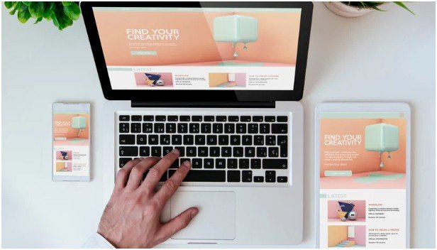
That is exactly how responsive web design helps small businesses. It makes one website adapt to phones, tablets, laptops, and desktops without forcing visitors to pinch, zoom, or fight the page.
Google recommends responsive web design because it uses the same URL and HTML across devices, making it easier to implement and maintain. Google also uses mobile-first indexing, which means the mobile version of a site plays a major role in how pages are indexed and ranked.
Better mobile SEO and local visibility
Small businesses depend on local searches. A customer may search for a plumber, salon, dentist, café, repair shop, or contractor while standing in their kitchen or sitting in a parked car.
If the mobile version of your website is weak, your search visibility can suffer.
Why mobile-first indexing changes everything
Google mainly evaluates the mobile version of a website for indexing and ranking. That means your desktop design cannot save a poor mobile experience. If your phone layout hides content, loads slowly, or breaks navigation, search engines may not understand your site properly.
Responsive design keeps the same content available across devices. This helps Google crawl your pages more clearly and helps users find what they need faster.
Lower bounce rates from better user experience
A visitor should not work hard to use your website. If they need to zoom in, scroll sideways, or tap a tiny phone number, they may leave.
Responsive web design fixes these common problems by adjusting layouts, images, menus, and buttons to match each screen size.
The small-business lost lead test
Here is a simple test I use: open your homepage on a phone and try to complete three actions in under 30 seconds.
Can you find the service area?
Can you tap the phone number?
Can you submit the contact form?
If any answer is no, the site is probably leaking leads.
More calls, forms, and sales
Responsive design is not just about appearance. It removes friction from the buying journey.
A mobile visitor often wants fast action. They may want to call, book, request pricing, check hours, or read reviews. Responsive design makes these steps easier.
What conversion-friendly responsive design includes
Strong mobile pages use readable text, clear buttons, short forms, fast-loading images, and simple navigation. The call button should be easy to tap. The form should not feel like paperwork. The service pages should answer questions quickly.
This is also where homepage planning matters. A responsive layout works best when paired with clear messaging, trust signals, and strong calls to action. That is why learning what should a business website homepage include can help small businesses turn design into real leads.
Lower website maintenance costs
Some businesses once used separate desktop and mobile websites. That created more work, more errors, and more cost.
Responsive web design uses one website. You update one page, one menu, one image, and one codebase. That saves time during content updates, security fixes, SEO changes, and design improvements.
For a small business, this matters. Every hour saved on maintenance can go toward sales, service, or marketing.
Stronger brand trust on every screen
Customers judge quickly. A broken mobile page can make a real business look careless.
Responsive design gives your brand a consistent look across devices. Your logo, colors, images, reviews, and service details feel polished everywhere.
That consistency builds trust before the customer calls. It tells them the business is active, professional, and easy to work with.
Faster performance and Core Web Vitals

Responsive design should also support speed. Google’s Core Web Vitals measure real user experience, including loading performance, interactivity, and visual stability.
Web.dev recommends good thresholds such as LCP within 2.5 seconds, INP of 200 milliseconds or less, and CLS of 0.1 or less.
In plain English, your website should load fast, respond quickly, and avoid jumping around while someone taps or reads.
Cleaner analytics and smarter decisions
Responsive design also makes tracking easier. Instead of splitting data between desktop and mobile websites, you get one clear view.
You can see which pages bring traffic, which devices drive calls, and where visitors drop off. That helps small business owners make smarter marketing decisions.
Quick responsive design checklist for small businesses
A responsive small business website should have readable mobile text, tap-friendly buttons, flexible images, simple menus, fast pages, visible contact details, and forms that work smoothly on phones.
It should also keep the same important content on mobile and desktop. Never hide key service details just to make the mobile page shorter.
FAQs
1. Why is responsive web design important for small businesses?
It helps small businesses improve mobile usability, local SEO, trust, and conversions with one flexible website.
2. Does responsive design help local SEO?
Yes, because it supports mobile-first indexing and creates a better experience for local searchers.
3. Is responsive web design better than a separate mobile site?
For most small businesses, yes. It is easier to manage, update, track, and optimize.
4. How do I know if my website is responsive?
Open it on a phone. If text, buttons, menus, and forms adjust smoothly without zooming, it is likely responsive.
Final take: your website should not embarrass you on mobile
A small business website has one job: help people trust you and take action. If it only works on a desktop, it is doing half the job.
That is the real power of how responsive web design helps small businesses. It protects visibility, improves user experience, saves money, and turns more mobile visitors into real leads. Start with your homepage, test it on your phone, and fix the friction before your next customer disappears.